

Digital
Products Documentation
Digital Products Documentation for .com Components (internally known as ZeroHeight Documentation Prioritization) was a strategic initiative aimed at standardizing the language and naming conventions for .com components while ensuring clear and consistent documentation for diverse teams, including site ops, marketing, and design. By streamlining and organizing our documentation space, we created consistency across digital products and provided users with essential guidelines and best practices for building components within the .com environment.
My Role
UX Designer
XFN Partners
The Team
1 UX Design Director, 1 UX Designer (me), 1 Project Manager
4 Product Owners, 1 Senior UX Designer, 3 Front-end engineers, 3 Developers
Timeframe
2.5 months
Tools
Figma, Miro, Jira
TL;DR
When Content Flow (CF) launched in Summer 2023, documentation was still aligned with the old CMS (Tridion), making it incompatible and outdated. Limited migration resources led to inconsistencies, forcing users to rely on unofficial workarounds, causing frustration and inefficiencies. To resolve this, we standardized documentation, updated all guidance for key components, introduced clearer governance, and improved accessibility with structured categorization and new resource pages—ensuring long-term usability and scalability for .com content teams.
Outcomes!
✅ All ZH guidance specs updated for landing apps.
✅ ZH guidance specs for PDP/PLP updated and in validation phase.
✅ Video Experience page is live.
✅ Copy written to match user’s language
✅ Foundation of new governance model for ensuring future quality of ZH guidance
✅ New resource pages regarding image specs, component names, etc.
✅ New user-friendly categorization
Context
When Content Flow (CF) launched in Summer 2023, documentation was still tied to the old CMS (Tridion), making it incompatible. Limited migration resources left guidance outdated, forcing users to rely on cheat sheets, leading to frustration and wasted budget. A comprehensive end-to-end approach was urgently needed.
Problem
Inconsistencies across systems and documentation was not up-to-date or built incorrectly for the main audience and user group that uses the platform daily to build marketing content and publish for .com.
PROJECT SCOPING
Inconsistencies Across Platforms
The ability to hack the old CMS system was not possible in the Content Flow. There is less freedom in CF causing upset/confusion/misinterpretations of using different types of specs.
-
~ Ratios
~ File sizes
~ Display styles
~ Some links did not jump to the right position of the source page
~ Mock-ups not up-to-date
-
~ All of the use cases on each component needed more context.
~ Touchpoint Guidance – technically possible but different recommendation per brand guidelines
~ Specs not applicable to CF (ZH referred to colors in HEX code while CF uses RGBA codes) - See image to the right
~ ‘Language barriers’ - In addtion to being a diverse global company, there were language barriers. However, we also noticed that someone from the design org may not understand the same term as someone in a more executional role like Content Management.

MINDSET & ASSESMENT
Component Harmony Quest

We built a small task force that included 1 project manager, 1 UX designer (me) and 1 UX Director. Every day we mapped out who we would meet to go through a list of components with Product Owners, Developers, UX Designers to bring to light the confusion/misled information.
-
Update .com component specs on ZH so they are consistent with CF and comprehensible to the users. Ensuring quality of the specs and full accuracy
(Building on the work of Q4, extra user research pointed out confusion with the user group)
-
~ 19 landing app components
~ 8 Components for Product Landing Pages/Product Detail Pages
~ 12 components per week in various stages
~ 1 Video Experience page
~ 300 Miro sticky notes
~ 4 review meetings a week with 4 different stakeholder groups across 7 weeks
-
My Project Manager and I used a Kanban board and component tracker to monitor the progress of each digital component. Since different Product Owners and Developers managed these components, this tool was the most effective way for us to log meeting notes, questions, and concerns.
RESEARCH & DISCOVERY
Gap Analysis
-
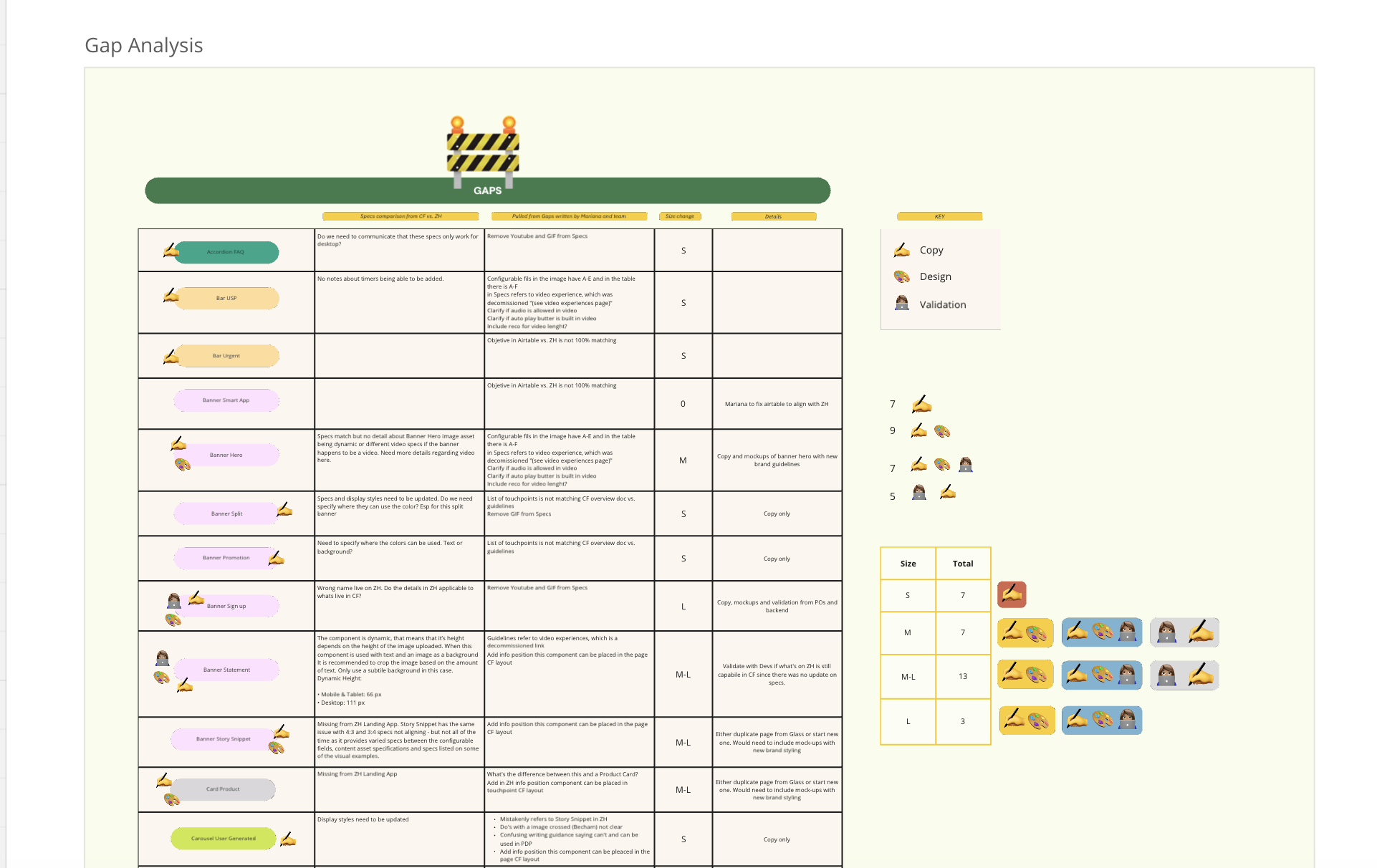
[Image of excel]: I analyzed between feedback from Content, Experience Planning, Digital Activation Managers and ZH documentation. Any/all gaps, any critique points and missing/broken links were collected into an Excel. This project was also building on the new namings for each component as a part of the new CF update (also listed under my UX work as Renaming Component Priorization).
-
[Image of emojis]: After I collected the notes from the excel sheet, I did an excersise in Miro where I sized up component - if it was a copy edit, that would be a S, mockups plus copy was a M-L. This way, it helped me create the tasks in the kanban board and allowed me to communicate clearly to my stakeholders and partner how much of their time I needed.
-
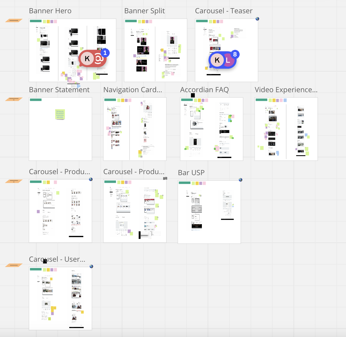
All component ZH pages were screenshot and organized in Miro. The feedback from gap analysis was directly placed next to relevant sections.
Something we kept in mind was the web of stakeholders was extensive + teams occupied with preplanned priorities.
-
[Image with Miro boards]: My Project Manager and I organized which components we plan to focus on depending on the sizes per day and week. This created transparency for our stakeholders. There were days where one batch of components would be in QA stage whilst the another is just getting started with reviews with Product Owners. Item description.
Image with stickies: A zoom in shot of the type of feedback we'd get from our users. I used the screen shots as a guide to walk through with our Devs and POs. Purple were questions or callouts for POs, green for designers, yellow for copywriters, pink were the correct answers and blue were additional notes.



COLLABORATION & IMPLEMENTATION
From Vision to Delivery

-
Managing stakeholder communications consisted of, weekly meetings were held between POs, designers, UX/copywriters, user groups and me for both landing app and PLP/PDP components to address feedback. Any questions outside of these meetings were communicated asynchronous via Teams chats due to time constraints.
Any unresolved questions were escalated to the user groups through chats or meetings.
-
I ensured design consistency by updating all outcomes in ZH, making sure every detail stayed aligned. As new developments rolled in after week 4, I meticulously logged each change in the components' page changelog, keeping documentation up to date and cohesive across the board.
REFINE & OPTIMIZE
Validation

-
I built a user-friendly validation tracker in Excel, making it accessible to everyone in the company, as not all participants had Miro accounts. The feedback and comments ensured a tidy workspace and trackable input. I facilitated a holistic end-to-end approach by understanding each team’s interaction with these components and their work methods, enabling us to tackle their challenges from their perspective
-
Engaged user group members tested ZH page specifications by replicating components in CF and verified touchpoints, display styles, and links while soliciting feedback. I reviewed and addressed all user comments and feedback in collaboration with Product Owners, Designers, and Developers.
-
We made sure to limit the users to only select, "Yes" "No" and if there was more feedback, we asked them to comment and tag me. Most of the time we noticed the users were confused as these changes weren't clearly communicated during the launch of the new CMS. We used this to interact with the users, share transparency if their feedback is being implemented or not. Those options were also in the dropdown, "RESOLVED", "CLOSED."
LAUNCH & MAINTENANCE
User Satisfaction
The "Glass vs Landing app" is typically used in a design & tech context, whereas the Activation/Planning teams (primary user group) does not use this categorization. Additionally, components are now organized alphabetically, making it simpler to find the desired component.
